
Temperature change can affect agriculture, energy demand, ecosystems, and recreation.
We report on Aotearoa New Zealand's overall annual average temperature, anomalies, and changes over time. We also report on how temperature and the number of warm days change over time at 30 sites around New Zealand.
Definitions and metadata has more information about this indicator.
Key findings
New Zealand's temperature
Based on Earth Sciences New Zealand's 'seven-station' national temperature series between 1909 and 2025:
- New Zealand's annual temperature significantly increased by 1.36 degrees Celsius (°C), based on linear trend analysis assessed at the 95 percent confidence level
- 2022 was the warmest year with an average temperature of 13.76°C, 1.02°C above the 1991 to 2020 climate baseline average for long-term climate change assessments (12.74°C)
- 7 of the 10 warmest years on record were recorded in the last decade (since 2016), and had:
- average annual temperatures at or above 13.37°C
- temperature anomalies ranging between 0.63 and 1.02°C above the 1991 to 2020 climate baseline average.
Note that the linear trend represents an average warming rate over the full period. Given that the underlying trajectory is non-linear, this estimate may understate or overstate rates of warming throughout the series.
Figure 1
| Year | Anomaly |
| 1909 | -0.36 |
| 1910 | -0.3 |
| 1911 | -0.81 |
| 1912 | -1.41 |
| 1913 | -1.17 |
| 1914 | -1.16 |
| 1915 | -0.8 |
| 1916 | 0.25 |
| 1917 | 0.06 |
| 1918 | -0.93 |
| 1919 | -1.35 |
| 1920 | -1.2 |
| 1921 | -0.88 |
| 1922 | -0.73 |
| 1923 | -0.89 |
| 1924 | 0.07 |
| 1925 | -1.15 |
| 1926 | -0.96 |
| 1927 | -1.12 |
| 1928 | -0.04 |
| 1929 | -0.79 |
| 1930 | -1.49 |
| 1931 | -1.29 |
| 1932 | -1.14 |
| 1933 | -0.68 |
| 1934 | -0.47 |
| 1935 | -0.27 |
| 1936 | -0.85 |
| 1937 | -1.07 |
| 1938 | 0.11 |
| 1939 | -0.81 |
| 1940 | -0.99 |
| 1941 | -1.01 |
| 1942 | -0.71 |
| 1943 | -0.98 |
| 1944 | -0.96 |
| 1945 | -1.21 |
| 1946 | -0.94 |
| 1947 | -0.68 |
| 1948 | -0.45 |
| 1949 | -0.73 |
| 1950 | -0.62 |
| 1951 | -0.94 |
| 1952 | -0.62 |
| 1953 | -0.68 |
| 1954 | -0.14 |
| 1955 | 0.05 |
| 1956 | 0.18 |
| 1957 | -0.28 |
| 1958 | -0.35 |
| 1959 | -0.59 |
| 1960 | -0.47 |
| 1961 | -0.46 |
| 1962 | 0.17 |
| 1963 | -0.78 |
| 1964 | -0.72 |
| 1965 | -0.86 |
| 1966 | -0.59 |
| 1967 | -0.47 |
| 1968 | -0.53 |
| 1969 | -0.56 |
| 1970 | 0.13 |
| 1971 | 0.36 |
| 1972 | -0.5 |
| 1973 | -0.05 |
| 1974 | 0 |
| 1975 | -0.13 |
| 1976 | -1.01 |
| 1977 | -0.97 |
| 1978 | 0.08 |
| 1979 | -0.19 |
| 1980 | -0.49 |
| 1981 | 0.12 |
| 1982 | -0.63 |
| 1983 | -0.71 |
| 1984 | -0.06 |
| 1985 | 0.11 |
| 1986 | -0.08 |
| 1987 | 0.03 |
| 1988 | 0.19 |
| 1989 | 0.23 |
| 1990 | 0.25 |
| 1991 | -0.57 |
| 1992 | -1.26 |
| 1993 | -0.9 |
| 1994 | -0.41 |
| 1995 | -0.15 |
| 1996 | -0.29 |
| 1997 | -0.47 |
| 1998 | 0.67 |
| 1999 | 0.61 |
| 2000 | 0.05 |
| 2001 | 0.15 |
| 2002 | -0.07 |
| 2003 | -0.12 |
| 2004 | -0.57 |
| 2005 | 0.37 |
| 2006 | -0.34 |
| 2007 | -0.07 |
| 2008 | 0.12 |
| 2009 | -0.45 |
| 2010 | 0.33 |
| 2011 | 0.09 |
| 2012 | -0.28 |
| 2013 | 0.59 |
| 2014 | 0.04 |
| 2015 | 0.01 |
| 2016 | 0.7 |
| 2017 | 0.41 |
| 2018 | 0.67 |
| 2019 | 0.63 |
| 2020 | 0.5 |
| 2021 | 0.82 |
| 2022 | 1.02 |
| 2023 | 0.87 |
| 2024 | 0.51 |
| 2025 | 0.77 |
Temperature at thirty sites
Between 1972 and 2025, average temperatures were very likely increasing at:
- 29 of 30 sites, annually
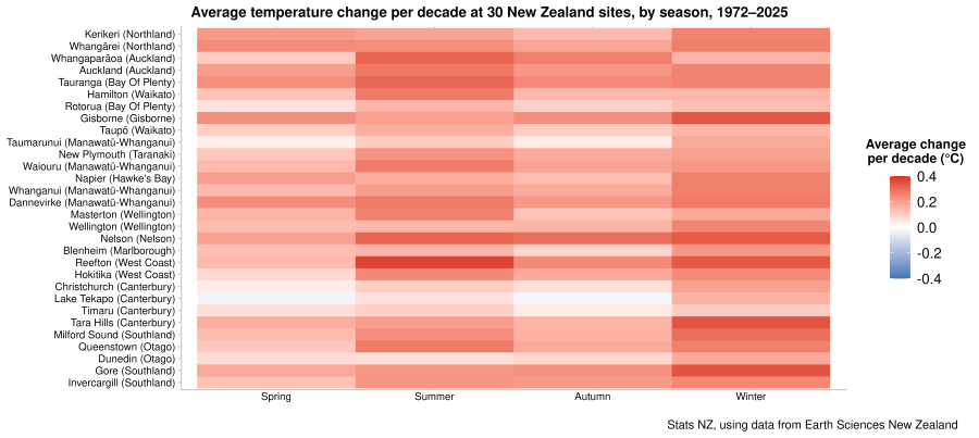
- 26 sites in spring
- 25 sites in summer
- 25 sites in autumn
- all 30 sites in winter.
Overall, average annual temperatures increased fastest in winter and slowest in spring.
Figure 2
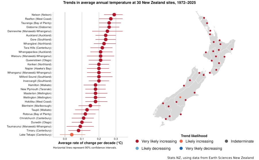
Figure 3
A warm day is when the maximum recorded temperature is above 25°C.
Between 1972 and 2025, the number of warm days very likely increased at 22 of 30 sites. There were no sites with very likely decreasing trends.
Temperature using gridded data
Earth Sciences New Zealand provided annual temperature data between 1972 and 2025 using a spatial interpolation process. The process estimates temperature where there are few or no observations.
These maps show broad national patterns, not precise local conditions. Comparisons between locations and over time should be interpreted with caution.
Figure 4
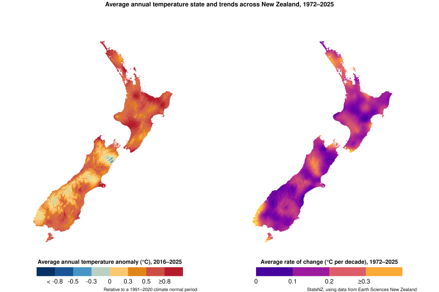
Text alternative for maps Average annual temperature state and trends across New Zealand, 1972-2025
Why it is important
Global average temperatures have increased by around 1°C in the last century, almost certainly because of high levels of atmospheric greenhouse gases emitted from human activities. While this change may seem small, relatively small changes in our climate can have big effects on our environment (Ministry for the Environment & Stats NZ, 2025).
Temperature change can affect agriculture, energy demand, ecosystems, and recreation. Climate change projections for New Zealand suggest that summer will warm more than winter and spring (Bodeker et al., 2022).
Temperature is also influenced by natural processes such as climate oscillations like the El Niño Southern Oscillation (ENSO). However, ENSO does not affect the long-term warming trend of the national temperature time series (World Meteorological Organization [WMO], 2014).
The number of warm days change from year to year in response to variable weather patterns and climate drivers. Climate models project we may experience more warm extremes in the future (IPCC, 2021). According to the WMO (2016), a decrease in cold days and nights and an increase in warm days and nights can have major implications for human health, agricultural production, and ecosystems.
Where this data comes from
Earth Sciences New Zealand
Definitions and metadata
Atmosphere and climate: Data to 2025 - DataInfo+ provides information on the methodology, metadata, and references supporting these statistics.
New Zealand's environmental reporting - DataInfo+ gives supporting information on Environmental indicators Te taiao Aotearoa.
Topics for environmental reporting outlines the 'Climate' topic, of which temperature is a direct measure.
Technical report
Environmental reporting indicators in the atmosphere and climate domain
Related indicators
Frost and growing degree days: Data to 2025
Global greenhouse gas emissions
Drought and wet periods: Data to 2025
El Niño Southern Oscillation: Data to 2025
Interdecadal Pacific Oscillation
Sea-surface temperature: Data to 2023
Greenhouse gas concentrations: Data to 2025
Related content
Our atmosphere and climate 2023
'Seven-station' series temperature data
Climate change 2021: The physical science basis
Text alternatives
Figure 2. Text alternative for graph and map Trends in average annual temperature at 30 New Zealand sites, 1972-2025
A bar chart (left) and map of New Zealand (right) show the average rate of temperature change per decade (in degrees Celsius) and trend likelihoods at 30 sites around New Zealand from 1972 to 2025. Dots on the graph show sites with the highest average rate of change per decade (°C) at the top, through to the lowest change at the bottom. Horizontal lines on the graph show 90% confidence intervals. Dots on the map show the location of each site. Each dot and line in the graph and dot on the map is coloured to indicate trend likelihood: very likely increasing (red), likely increasing (orange), indeterminate (grey), likely decreasing (light blue), and very likely decreasing (dark blue). Stats NZ, using data from Earth Sciences New Zealand.
Figure 3. Text alternative for graph Average temperature change per decade at 30 New Zealand sites, by season, 1972-2025
A tile graph shows average temperature change (in degrees Celsius per decade) for spring (left), summer, autumn, and winter (right) at 30 sites, based on trends between 1972 and 2025. Each tile is coloured to indicate rate of change per decade: increasing temperature (red) and decreasing temperature (blue). Stats NZ, using data from Earth Sciences New Zealand.
Figure 4. Text alternative for maps Average annual temperature state and trends across New Zealand, 1972-2025
Two maps of New Zealand show the average annual temperature anomaly (in degrees Celsius) between 2016 and 2025 (left) and the average rate of change (in degrees Celsius per decade) between 1972 and 2025 (right) on a high-resolution grid across New Zealand. Grid cells on the left map are coloured to indicate average temperature anomaly (°C) against the 1991 to 2020 climate baseline average: less than -0.8 (dark blue), -0.8 to -0.5 (blue), -0.5 to -0.3 (light blue), -0.3 to 0 (light green), 0 to 0.3 (light orange), 0.3 to 0.5 (orange), 0.5 to 0.8 (light red), and 0.8 and above (dark red). Grid cells on the right map are coloured to indicate average rate of change (°C per decade): 0 to 0.1 (purple), 0.1 to 0.2 (magenta), 0.2 to 0.3 (light red), and 0.3 and above (orange). Stats NZ, using data from Earth Sciences New Zealand.
Technical enquiries
Environment statistics team
[email protected]
Archived pages
Temperature - published September 2023


