As part of Analysis in Government month, this is the third in our series of 'Five things you didn't know about…' blog posts. Analysis in government is being used more than ever in policy, decision making and the media, this series of blog posts will share, showcase and celebrate the vast variety of professions and work within the Analysis Function.
Jump to one of our posts:
- Five things you didn't know about how we make data understandable
- Five things you didn't know about evaluation
- Five things you didn't know about actuaries
- Five things you didn't know about the data masterclass
- Five policy areas where ADR UK is having an impact
Five things you didn't know about how we make data understandable

By Catherine Hope, Department for Work and Pensions (DWP)
I've been passionate about presenting data clearly for over 10 years now, and recently took the lead of a cross-government group of presentation champions. We share best practice for designing charts and tables, and we're learning about writing for the web to help everyone understand the huge amount of data that government publishes.
In this role and in my day job as a statistician for DWP Digital, I tell stories with data.
Sometimes these stories help teams to make decisions about whether a change they made to a process has worked, or if they need to try something else. Or sometimes the stories make government data available to the public in an easy-to-understand way.
In all cases, the most important thing is to write for everyone, and to tell the story in a way that readers understand. With that in mind, I've pulled together some ways in which we present data to try and make it as understandable, open and accessible as possible.
1. We think about our users
It's really easy to write something or present data in a way that you understand. The problem is, you have a lot of baggage: your subject knowledge of the thing you're presenting, its historical context, your technical knowledge of the way you did the analysis, and what conclusions can be made from the analysis.
It would be very unusual for everyone seeing your data presentation to have exactly the same knowledge as you. Otherwise, what would be the benefit of sharing that knowledge with them?
It's essential to think about who your audience is going to be, and to write for them. If you don't know who your audience is going to be, like when I present government data for the public, you can't make any assumptions about what they already know.
2. We keep it simple
The use of plain English will make your analysis easier to understand for everyone - even those as steeped in jargon as you are. Nobody ever read a simple sentence and thought "well, that was too easy to understand."
Jargon and acronyms, which are often used in government, can alienate people. You might be presenting your work to a team you know really well and assume everyone knows what HRTs and JBCs are (habitual residence test and the Joint Biosecurity Centre, if you were wondering). However, if one member of the team is new to the role, you risk making them feel excluded because they cannot keep up.
Explain your acronyms and give a bit of context about the subject. This is the case with technical concepts and language too. When I analyse whether a change to a process has made a difference, I use statistical tests to see whether that change might have happened by chance, or whether it was a "significant" change. When I present the results to the team, I will always talk about what the test means and what conclusions we can or can't make.
3. We tell the story
I'm steeped in the detail of the things I present analysis about, but my audience might not be. I try to tell the story and give enough context so that people can understand why the data I'm showing them is important.
Simple annotations can really help this. Below are two charts I made from data about the social security benefit Universal Credit (UC). It is a payment to help with your living costs. You may be able to get it if you're on a low income, out of work or you cannot work.
A line chart showing claims in universal credit over time, with a sharp peak in March
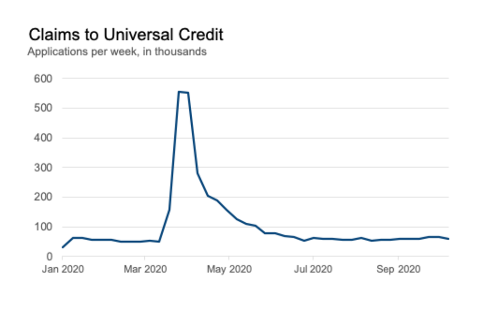
The title of this chart tells you what the chart shows: the number of claims to UC. It shows a massive peak during the year, and that the number has gone back down again. But it doesn't say what caused that peak.
A line chart showing claims in universal credit over time, with a sharp peak in March, with an annotation
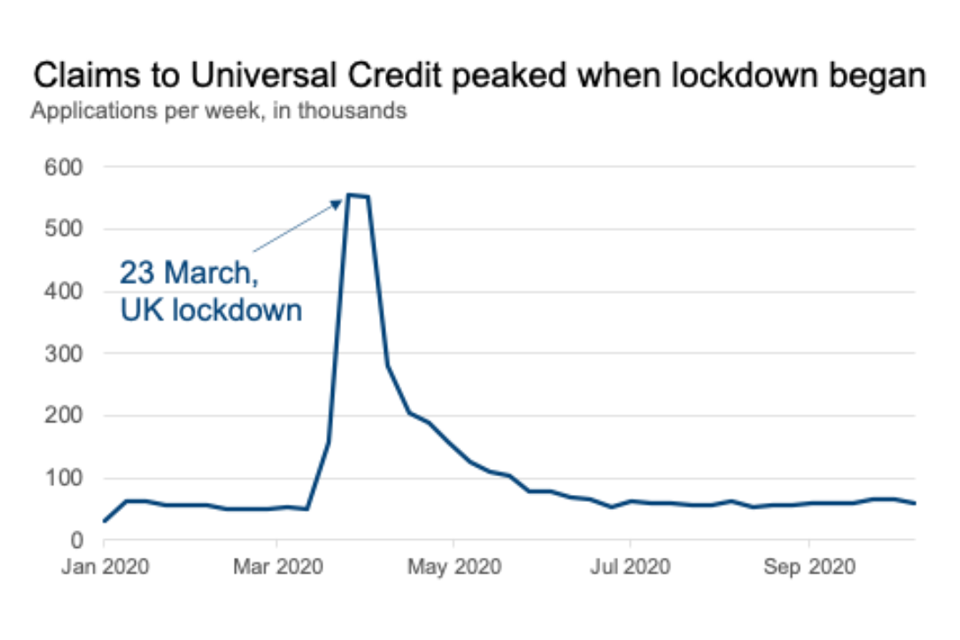
Simply by adding an "active title" to the second chart, I'm explaining more: that claims to UC peaked when lockdown began. I've also added an annotation directly onto the chart to point out where 23 March is - I've not assumed that you know when the lockdown happened in the UK.
Doing this helps people to think "oh, I see" and it helps me to know that they've understood from the chart what I wanted them to. I've told my story.
4. We include everyone
Accessibility isn't (just) a legal box to tick, it helps us make sure that everyone can use government statistics and data, regardless of the technology they use. This is for everybody.
Making data easy to understand is only one of the ways of making it accessible: information published on the internet needs to meet all of the Web Content Accessibility (WCAG) Guidelines.
In the cross-government group of presentation champions that I lead, we've been focusing on how to make government statistics meet these guidelines. WCAG asks that content should be:
- perceivable: having captions on video/audio, and contrasting colours that can be seen by people with colour-blindness
- operable: can be navigated by people who use only a keyboard not a mouse, or use screen-readers
- understandable: using plain English, or identifying errors and helping people correct them if a website needs input from you, like applying for UC
- robust: being compatible with assistive technologies, and using mark-up correctly
The GOV.UK platform does a lot of the technical side of this for us, which is why we have focused on the way we present charts and use words to describe what's happening.
The presentation champions carry out reviews of government publications and offer advice to the authors about meeting best practice in how we design charts and the words we use. While similar to user research, where researchers would talk to people who use the statistics, but it can help to get an "outsider's" perspective - to take a step back from the detail.
5. We help people make decisions
Data has taken much more of the limelight this year than before. Charts were being shown on the television on a daily basis during the early phase of the coronavirus COVID-19 pandemic.
People need access to information like this in an easy-to-understand way, because they are making decisions about how safe it is to leave the house. This may sound overly dramatic, but these could be life and death decisions for some people. It is our duty to make sure they can make well-informed decisions.
If you'd like to learn more about presenting data, there are some resources that are free to use:
- Department for Work and Pensions Data Visualisation Thinking
- GSS guidance on Writing about Statistics guidance
- GSS Introduction to Data Visualisation guidance
Five things you didn't know about evaluation

Written by Steven Finch, Department for Transport, Chair of Cross-Government Evaluation Group
There have been some important changes in government evaluation over the past year or so, with more to follow in the coming year. Here are five things that you may not know.
1. Last year's Magenta Book was a substantial revision
The revised Magenta Book was launched at the height of the Covid-19 crisis on 1 April 2020, so you wouldn't be a fool if you missed it!
You may not realise how substantial a revision this was, the product of a few years' work by analysts in the Cross-Government Evaluation Group (CGEG), which comprises the evaluation leads in government departments. Among the changes reflected in the new guidance were:
Changes in government evaluation such as the experimentation agenda (eg 'Test, Learn Adapt' in 2012), the What Works Network and Trial Advice Panel.
The growth of new evaluation methods, notably theory-based impact evaluation methods which can complement or provide an alternative to experimental and quasi-experimental methods.
New thinking about evaluation in complex settings by the ESRC Centre for the Evaluation of Complexity Across the Nexus(CECAN).
2. It came with several new annexes
While the core Magenta Book document is more concise than its predecessor, it is accompanied by several new annexes which expand the guidance significantly.
There are new annexes covering Analytical Methods used in evaluation, Handling Complexity in Policy Evaluation (authored by CECAN), Guidance for Conducting Regulatory Post Implementation Reviews and Realist Evaluation.
Another important new element is a Government Analytical Evaluation Capabilities Framework which can be used by analysts as a tool for planning skills development and training.
3. It has been followed by a wave of capability-building activity
Across government, there is a concerted effort underway to build capabilities in evaluation.
CGEG, which aims to improve the supply of, stimulate demand for, and encourage the use of, good quality evaluation evidence in government, has recently undertaken a mapping of evaluations of COVID-19 response interventions, to facilitate joining up of evaluation approaches and evidence. Several of its members have been delivering evaluation training courses within their departments
A new entrant in this field is the Best Practice and Impact (BPI) division in the Office for National Statistics which is working for the Analysis Function to provide on-the-ground support in evaluation for parts of central government and devolved administrations where this is not available. CGEG is supporting the BPI to develop its offer and has enlisted its support with making the case to Civil Service Learning to include introductory training for analysts and policy makers in its curriculum.
4. Evaluation has been embedded in Spending Review processes
The Spending Review 2020 (SR20) saw a step change in the focus on evaluation in the context of spending decisions.
HM Treasury included new requirements for spending bids to state both:
- what evidence supported the case that funding would deliver its intended outcomes, where this was available
- what monitoring and evaluation plans were in place to demonstrate wjat outcomes would be achieved
These returns were scrutinized and feedback on evaluation plans was incorporated in departmental settlement letters. A subsequent Outcome Delivery Plan process has captured departmental evaluation plans for priority outcomes.
5. The Evaluation Task Force is here!
Announced the Chancellor's SR20 policy paper, the Evaluation Task Force started work in April.
This new unit, which is based in the Cabinet Office and HM Treasury, aims to improve people's lives by ensuring robust evidence on the effectiveness of policies and programmes sits at the heart of spending and operational decisions. It will do this by scrutinising evaluation plans in business cases submitted to HM Treasury and by working with departments to advise them on the design and delivery of robust, proportionate evaluation, in particular for priority programmes. It will also track the delivery of evaluations and their emerging results.
For all the reasons stated here, we can expect growing attention to government evaluation in the coming year. If you would like to know more, please


