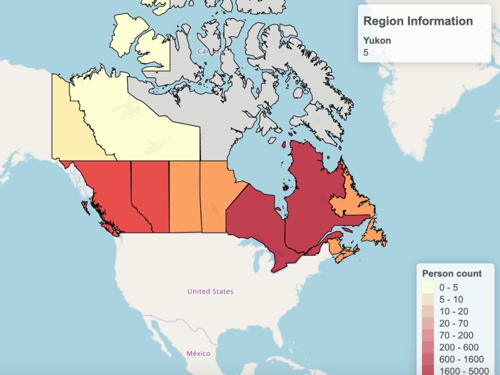
In an effort to help people and public health officials, a team of University of Alberta researchers have developed an interactive tool to visualize past, current and future data for the COVID-19 pandemic.
The tool, called Covidmapper, works like a heatmap, displaying information about the impact of COVID-19 around the world, using several algorithms to pull and process data provided by the World Health Organization as well as governments and post-secondary institutions around the world.
"This will help convince people to take the pandemic more seriously," said project lead David Wishart, a U of A professor with expertise in biology, biochemistry and computing science.
"I think by making the data more accessible, more visual and more interactive, more of the public and more health officials can be more informed."
Wishart noted that the data collected by Covidmapper could eventually be used by epidemiologists to see how the pandemic evolved, determine which interventions were effective and inform future pandemic planning.
"Covidmapper is more flexible and informative than almost any other heat mapping tool on the web," Wishart explained. "We plot the number of cases, the number of deaths, the daily percentage change of cases and deaths, the number of COVID-19 tests performed and, most importantly, the 'real' number of cases—calculated from several models of the incident fatality rates."
Covidmapper allows users to select any date and see what the numbers look like in the past, today or even projected in the future. The software is based on a web-based tool called Heatmapper that Wishart and his colleagues originally developed in 2016 for plotting various kinds of biomedical data.
"Epidemiologists use geographic mapping data to track epidemics and pandemics," said Wishart. "However, we felt it was also important to collect and publicly release this COVID data in a format that is usable and understandable by the public, the news media, politicians, public health officials, medical groups and other members of the community who are trying to understand or plan for the pandemic."
Covidmapper is available online, and all data collected on COVID-19 statistics are free to download.


