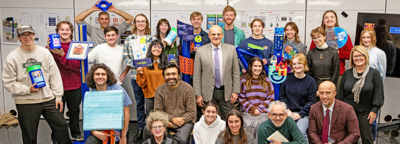
A University of Cincinnati DAAP design research team is working with Cincinnati Metro on a new transit signage and wayfinding system that improves legibility, accessibility and user experience across the region's bus network. The collaboration brings students, faculty and interdisciplinary stakeholders together to create modular, research-driven designs for bus stops, park-and-ride locations and upcoming Bus Rapid Transit (BRT) transit projects.
A faculty-led design team from the University of Cincinnati's College of Design, Architecture, Art and Planning (DAAP) is helping Cincinnati Metro redesign its bus stop signage and wayfinding, a project that reimagines typography and design as "civic infrastructure."
Muhammad Rahman, an assistant professor in DAAP's Ullman School of Design, is collaborating with Metro's parent organization, the Southwest Ohio Regional Transit Authority (SORTA), beyond a traditional consultant relationship. His students, Micah Shannon and Anh Hoang from Communication Design program, worked with him directly in the eXperiential Design Lab (XDL) on the signage and wayfinding components of the larger projects.
"It's a design system, not just a singular thing," he said. "Rather than functioning like a typical consultant, we worked as an embedded researcher-through-design team in the collaborative process."
The project brings together stakeholders who do not always work side by side, including transit engineers, planners, social historians, urban designers and community members. Rahman said the work has been an opportunity to demonstrate how design can improve public systems.
"Design can't be public infrastructure if it only belongs to experts," he said. "Design becomes a bridge when it integrates public feedback and helps people understand what they're getting."
While one visible outcome is a bus stop sign, Rahman said the work is part of a larger framework that includes wayfinding, color contrast, city guidelines, legibility, hierarchy and identity.
"A bus stop sign is not just a pole," he said. "The research repositioned bus stops as public places but as urban design systems and critical public spaces where interaction, waiting, orientation, and civic exchange occur daily. This conceptual shift grounded all design decisions in lived experience and let legibility build civic trust," Rahman emphasized.
The team explored how transit infrastructure could do more than communicate routes. Rahman said the goal is to improve the experience of waiting for a bus, including modular elements that could support interactive and educational features.
"It doesn't have to be a bus shelter," he said. "It can be something simple and modular where people can interact, where kids can have something to do, or where riders can learn about the history of a site."

Graphic prototype for bus stop elevation. Photo provided.
A key focus of the project is helping riders understand information quickly in public space especially at a distance and in low-light conditions. "You're not reading a sign from 2 feet away," Rahman said. "Sometimes you're reading it from 10 feet away, sometimes in the dark, and you need to understand the hierarchy of information."
The design team emphasized typographic spacing, alignment and contrast, refining details that are often overlooked in transit signage. "When you see the final product, it will look simple," he said. "But what appears simple is deeply intentional: every decision supports faster comprehension and reduced cognitive load for riders." Rahman said.
The team moved away from traditional assumptions about what is "most legible" in print settings and instead designed for public-space conditions such as distance, speed, lighting and information priority.
The team reviewed typefaces that have historically been considered legible, including existing typeface called Optima, as well as widely cited options such as Proxima Nova or Gill Sans. Ultimately, after comparing 17 typeface candidates using a rigorous matrix, the team selected Navigo as the most suitable option-a typeface developed for navigation systems, and customized spacing between letterforms and hierarchy to ensure clarity at multiple viewing distances. The goal was to reduce redundancy, prioritize information by importance and make complex transit information readable on a compact sign. The design also reduces redundancy by identifying what riders truly need at the stop and what can be delivered through digital tools.
DAAP students contributed through studio-based work, testing designs through timed readability and comprehension exercises.
"It was a series of A/B testing and refining micro and macro typography" Rahman explained. As the design progressed, the team delved further using the Visual Attention Software (VAS) by 3M to understand the areas of interest, visual hierarchy of elements, and user's gaze sequence to reorganize and refine the initial prototype. "Which one helps people find the route number faster? Which one is clearer?"
Communication design studio collaboration with SORTA Metro. Photo provided.
The first elements of the redesign are already being implemented, including signage for Metro's park-and-ride locations. Implementation of the full bus stop signage is expected to begin in spring 2026, following engineering requirements tied to slope, lighting and safety codes.
"It's a big project for Cincinnati transit and I believe the efficacy of typography can elevate civic experience," Rahman said. "We as a team worked closely with the city to be sure the sign is safe and meets breakaway requirements."
The bus stop signage is one critical part of a broader collaboration between DAAP and Metro/SORTA led by Danilo Palazzo, professor and director of the School of Planning at DAAP, and Vikas Mehta, professor in the School of Planning at DAAP. Rahman said the design team is also supporting Metro through redesigning communicative annual reports for policy makers, navigation-based site audits, and public-facing communication materials, as well as a mobile-friendly regional mobility guide intended to make transit information more accessible.
Featured image at top of a bus stop sign installed in the city.


